Context:
greetings, today with this post i would like to suggest for Newer Markers along side a new system in order to make everything a bit organized and better to be seen.
every marker that you see, i made it. in order to avoid copyright infrangements and stuff like that. ( nor that i could find the ones that i wanted to share )
there’s quite a lot to talk about, so i’ll go with the most important ones at the beginning and proceed with the others. if you think i missed anything, just comment down below, and i’ll add it.
without further do, let’s being.
Newer System Opacity on Icons and markets:
ok so, what i mean with this, is that in the current state, if i use the mark system on something that it’s far away, it " blinds " me because i can’t see what’s behind. so, it would be better if the opacity of markers change. here some pictures:
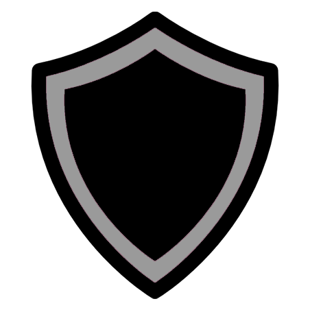
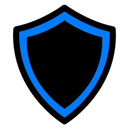
Current Issue:

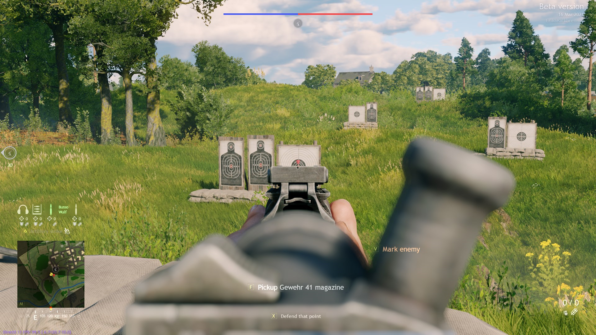
what i would like is that whenever i aim at markers, the opacity changes in order to allow the players to see behind that marker and don’t obstruct their visual:

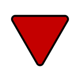
Spotting ( V ) Mark:
also known as the Red Triangle whenver you use the V button:
i think it can remain as it is and maybe a bit bigger, but, the other present mechanic within this marker, should be changed, and i explained a bit bettere here what and why:
so, keeping that in mind, the icon of the marker directed for the bots command should look like this:
in order to keep track where my AI are looking at when i’m doing something else.
Hold Order:
the current icon:

in my opinion, it should be changed. because when looking at foliage and due to the icon size and color ( but mainly size), sometimes it’s hard to be seen.
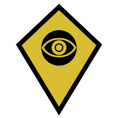
so insthead, i would suggest the replacement with this icons:
easier to see, a bit of contrast and color present as well.
Attack/Defend And Hold Order:
same thing it goes for the previus one,
harder to see…
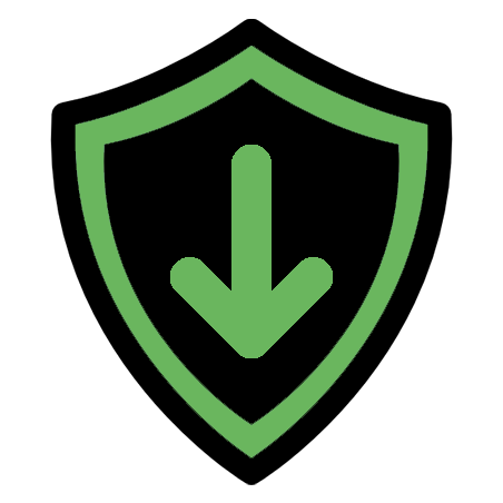
so if the territory is neutral, the icon when appointed to that specific point will be:
if the Territory Is Already Controlled by the player’s faction, the Defend order icon will be:
and lastly, if the territory is in enemy control, the icon will become:

fairly simple.
Team Up/ Squads Made Of Friends Markers & Colors:
this section is whenever you play with friends.
taken inspiration from: Squad improvment ideas
on The UI it would be cool if we can recognize each member in the " squad/platoon " with different colors.
Example:
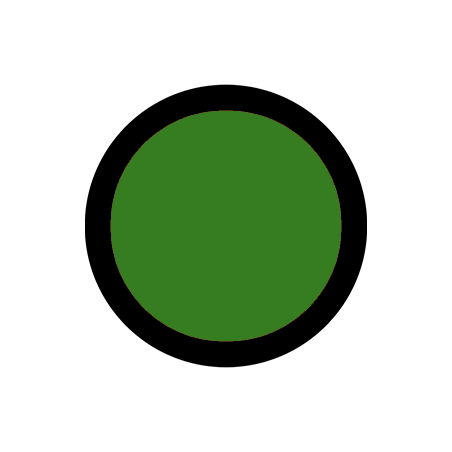
Squad Leader ( who ever creates the squad and has power to start any match ):
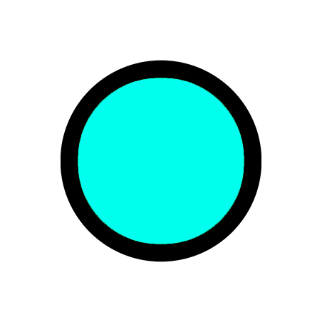
1st player that join the squad:
2nd Player that join the squad:
3rd Player that join the squad:
and as such, member’s colors will be displayed on the map and each Marker Placed by one of the teammates will show the Color of who placed the marker. for a easier coordinations.
Others Marks:
honestly, the AA, MG, Tank and Ammo boxes icons i think are ok and don’t need further changes. and i think i covered up all the aspects for the squad insthead.
so that’s it from me. what do you folks thinks about it.
 I hope you will be heard mate