Greatt work teamms keep it up, never been better. But uhmm this may pass alot. But… can we get voice chat? Its really nice if you can add it so we can communicate to each other better. Like Arma 3 or squad . But… please re consider this with the team. Few notes as warnings are like : Toxic players, In appropiate language/speak, and many more

New UI is more “modern”
But not really useful.
Why switch faction button is so small and being put so aside?
And squad icon is very useless in main screen. Just for switching different squads on main screen? I’d rather it completely go away and hide in second step menu.
Also BP should be on the right side, together with those events.
BP neednt to take such large and unique location in UI.
7 Likes
I love the style but I dislike the layout. Please revert the layout
1 Like
Could you please add the option to disable the background effects in the lobby.
- They are needlessly GPU intensive. I just want to modify my squads in peace, don’t want my GPU fans going off full blast while I am simply sitting in the lobby. Not to mention its a waste of electricity and produces pointless heat waste.
- The dust / smoke / particle effects fly by way too intensely which is extremely nauseating / distracting.
Would like to just have a static color background or the option to choose one of the wall posters as the backgrounds.
I feel like the interface is literally a downgrade.
Vertical tech tree was nicer. It is now harder to see which thing you have researched cause there is so little contrast between the new icons. Before it was bright white and dark grey. Now it is like shiny bright grey vs shiny dark grey. Like wtf?
The squad adjustment screen being its own tab was also dumb. We want less clicking and a way to see more info quicker. Everything is buried under too many needless interfaces.
3 Likes
The style is nice it looks cleaner and neater. However, I think the new system is MORE confusing and more work than the old interface. The big thing is that there are still too many tabs. Why do I have both a squads tab AND a squads button? Why is Progress a tab only? Should be a button. Upgrades? Also not button. just a tab. And my least favorite is the shop tab. This should have remained as “logistics” to keep in the feel of this being a military game. Furthermore, this tab is just a lot less intuitive to use than the old tab. The nice big obvious buttons with pictures are gone and you just have … MORE TABS. The same can be said for the upgrades tab. I miss the big obvious buttons. IDK, I am willing to admit that some of these complaints can be attributed to the fact that it is different and therefore will take some getting used to. But, that’s just the thing. I expected IMPROVEMENTS, not just a change in layout and sharper colors. Basically you just moved some buttons around and called it better. You didn’t make it any easier to use. You didn’t make it any more intuitive. It’s just a bunch of changing happy to glad and small dog to puppy.
3 Likes
Positive:
It looks clean and I like the visual upgrades you gave all the equipment! The shop layout is much easier to navigate and I like the organization of the screens.
Needs Improvement:
I don’t like how I now cannot edit my squads on the main screen. For some reason, it seems like the UX (User experience designer vs graphic designer) person decided to put the BP and promotions at the top of the priority for the user to see and interact with. Both those two buttons take up like 33% of the screen when we as players have other priorities for what we want to see on our battle page (Squad equipment, ability to swap to a different squad preset, showing the time period you will be matchmaking for with the selected gear). I don’t want to have to navigate to the squad screen to edit my people. It might be useful to consider moving the BP and the Promotions to the Progress page since the BP is also a progression tracker as is. Putting the equipment on the top and the battle pass on the bottom would free up much-needed space on the main screen for the squad loadouts.
Horizontal scrolling for the upgrades. The new way it looks is great, just switch it back to vertical trees. The horizontal ones are confusing and even with trees that I have maxed out.
Events and Custom matches could be a static button and not a responsive thumbnail to also save space.
Once the campaign button is removed due to the combination for the new enlisted, I would suggest moving the army selection button to replace it at the top center of the screen.
Thank you and can’t wait for the release!
3 Likes
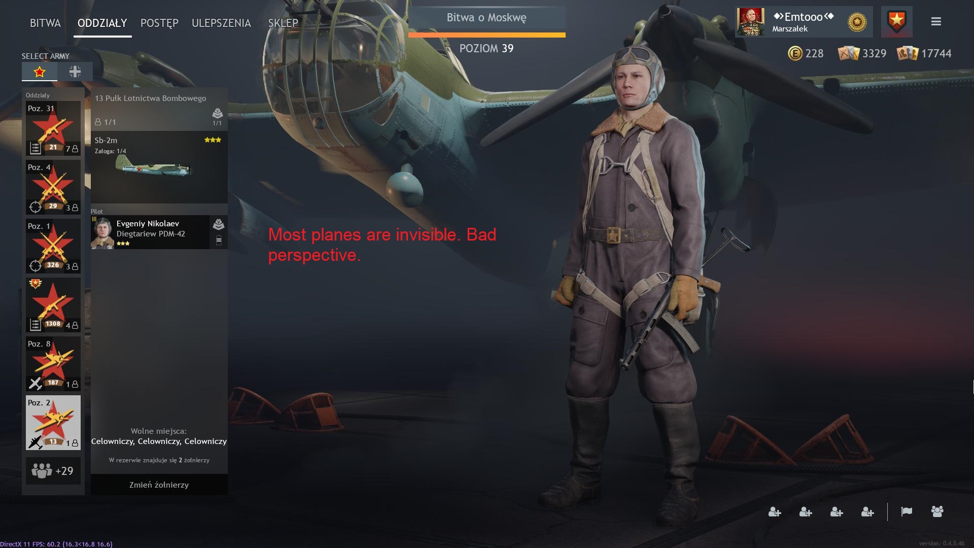
Please could you revisit the Airplane hangar UI to make the camera a bit more zoomed out? It’s a bit too close to the plane and if you want to put any customisations on it it’s very tricky now. I don’t even know how to position the camera to get a look at or customise on the rudder anymore

3 Likes
IDEA: In the old interface for the upgrades area, there was a simple national symbol showing you at a glance that your upgrade tree had been fully unlocked.
In the new system, some type of simple symbol could convey the same information at a glance so that you do not need to tab through each of the three upgrade trees to see if they are fully unlocked or not.
2 Likes
Hi, is it possible
- to add start button on squads tab. After battle u usually upgrade soldiers and squads, and then push start again. But in new ui we need to click quads after battle, do things and click battle again, which twice as mush, while battle tab, exept of start button, is useless. Earlier version of this page was much more useful and respected player’s time.
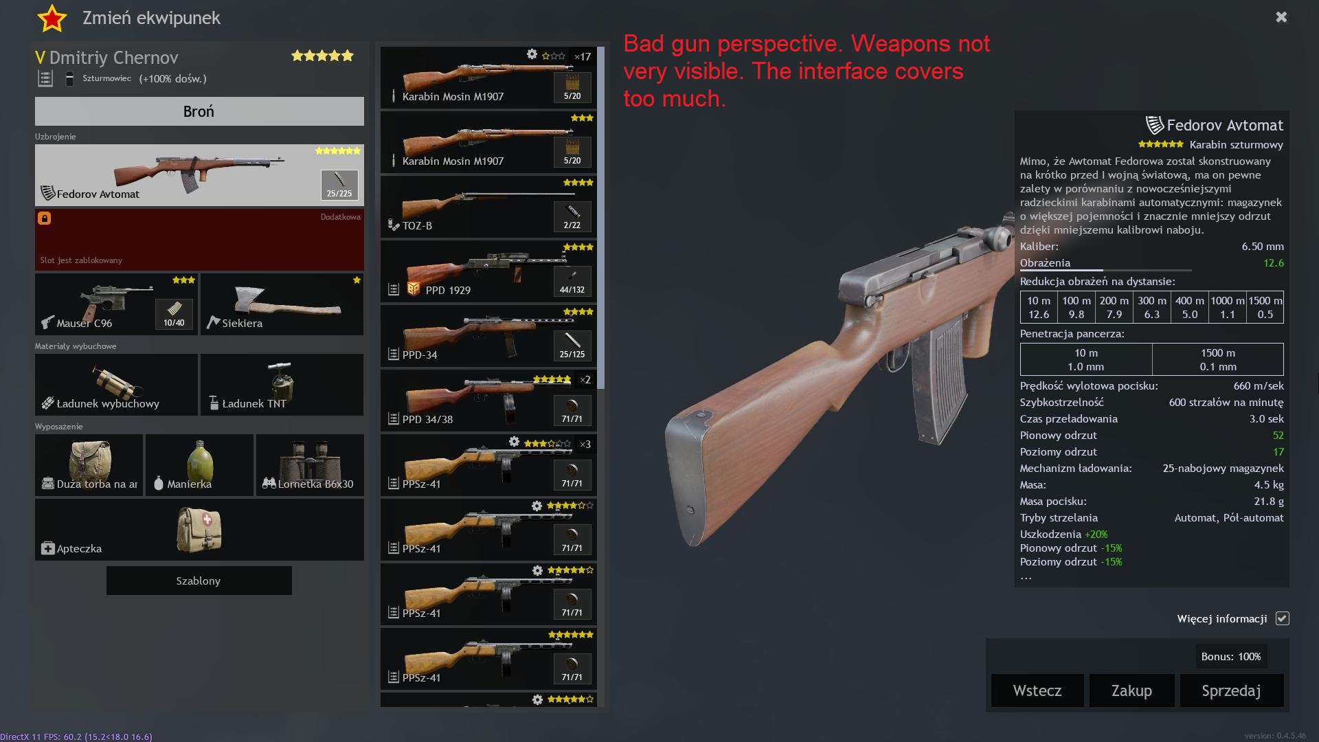
2)Second thing is strange decision od turning guns right, bayonet now looks strange, nobody ads bayonet on the butt of the rifle, it should be on barrel side.
It looks good from esthetics, but from user experience is trashy.
4 Likes
++
3 Likes
You never fix TEAM BALANCE! Why? why? why!
Its most important problem!
And your new U.I. is sh`it
New UI seems pretty clean. Just going to take some getting used to, especially awaiting for the next overhaul meta-changes that I’d imagine allow the new UI to make more sense than the old UI.
A few things that stand out to me the most for ‘improvement’ is in the ‘Upgrade’ sections.
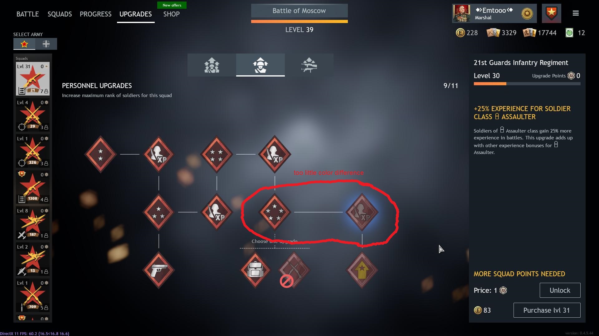
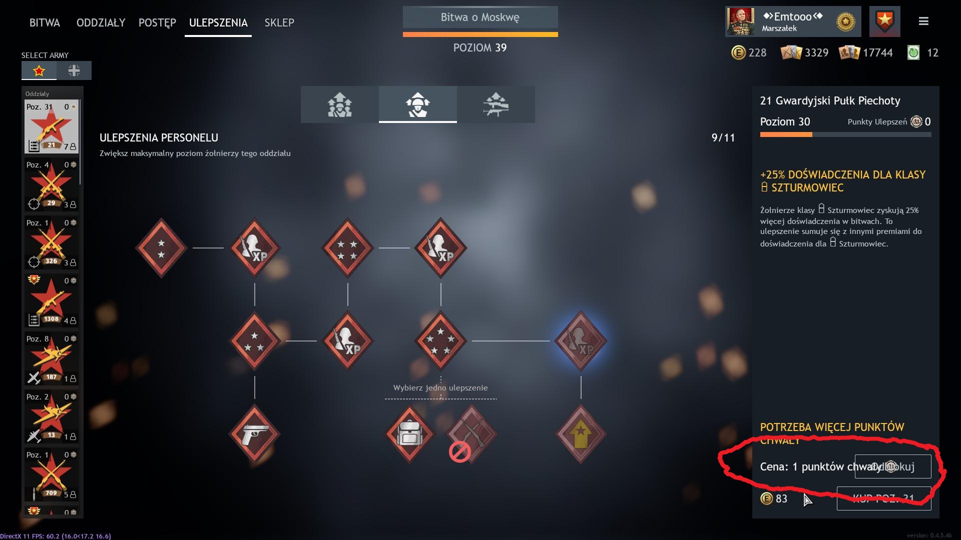
Overall, the color difference of the icons between inactive and activated upgrades are very subtle and hard track sometimes. Perhaps stronger/vivid colors and/or more whitish or gray toned respectively would help differentiate.
Squad and weapon upgrade tabs looks good. However, the Personnel upgrades look a bit messy. I would like to see more consistency with the other two tabs. Though it would have to change the order of upgrades, I’d suggest change is so that rank upgrades are on a single horizontal line, then have XP and modifications branch off the ranks. Also noticed that some squads that do not have many squad upgrades (such as aircraft) skew into an inconsistent pattern as well.
I would like the ability to cancel matchmaking even when not on the main page.
Lastly, as a personal preference. I liked the BattlePass and daily tasks above the Matchmaking button. In the old UI, I did not have to look all over the screen before pressing ‘Start’.
Thanks for your continued efforts and time in reviewing our feedback, hope it helps.
Agree!
a simple ‘‘v’’ like check you know, would do it.
Aircraft hangar is total fail, you try one of the bigger attackers and all you see is an engine and part wing in your face…
I can’t understand what dumbass is positioning and choosing viewving distance for the UI. It’s all crap tbh
I have some reservations about the new interface. Too little color difference between unlocked and locked perks. Levels are incorrect. Still the achievements of the day are not updated in real time. This is very problematic. There are errors in the length of the text in Polish. Weapon selection is bad. You can see the gun from the butt side. In addition, the interface obscures 90% of the view of the weapon. Most tanks and planes are too big for the hangar. Zoom out the camera view so you can see the entire vehicles.

4 Likes
Actually upgrade menu is confusing… i kind of don’t like it…
Also when are you going to unlock the last upgrade (the veteran) more than year is saying “future version of the game”.
Also are you considering transferring upgrade points from 1 team to other ?
I’d rather manage my squad from the main screen, i don’t know if i got used to it or is it just very convenient but please keep that
MY GOD YES. Devs, please, take notes. Veekay45 concept is awesome.
The current home interface is just confusing and full of stuff
new UI sucks