This is a surprisingly constructive thread. Right on.
2 Likes
Those are so cursed they remind me of some Alien™ variant…
2 Likes
This is bad, the battlepass does not need to take the centre stage, leave it to something more useful
Great to know people care about it  If you like it i could try to edit the mod so it would fit to the new interface.
2 Likes
The new UI you created seems too perfunctory. We need a more realistic background. The background in your preview image looks like a large gray area, like shooting a horror movie.
Additionally, when can you improve the character movements? They look so stiff.
5 Likes
Atleast the new UI could allow you to distance the soldiers from each other a bit

Of all the hangar mods, I actually like this one the most with all the details and the environment on it.
6 Likes
Should be a shot, of a pod, of Orca killer whales, for the portrait. 
The developer said that tickets other than gold tickets would be abolished and unified into a currency called “silver”, but did you withdraw? What is the reason.
Also, will the selectable factions be integrated into the Allies and Axis instead of country units? For example, even if I want to advance only Germany, does the tree include Japan and Italy, and do I need to develop them together?
@1942786 are there any plans to update party UI for people on friends list?
-
Knowing who is in a game and in lobby
-
Being able to message people anytime so you can set something up.
-
Proper chat box in main UI for talking.
Myself and others been asking for this for a long time. Be nice to get an answer, been a supporter since CBT
7 Likes
I hope by premium you mean premium + event squads.
8 Likes
I’m a classic, cultured man. I want Mobidic.
Done by the exellent artist who already do all our portraits.
4 Likes
I started playing this game in November 2020. Although I am an old player, I would prefer to have more new players play Enlisted. Therefore, I believe that Enlisted must balance the game matching mechanism to make each game more fair, rather than unilaterally killing or being slaughtered. Additionally, I strongly recommend that the friend system in the game be fully developed so that we can not only see if our friends are online, as we do now, We also need to see the game status of our friends, such as whether they are waiting at the intersection of the hall or in the game. Additionally, we particularly need a friend text chat system in the hall, similar to War Thunder. I also really want a more complete playback function. I like editing it, and I remember holding down Shift used to accelerate the movement of the camera. Why has this very useful free recording function disappeared? I need it to make better videos to promote our game
6 Likes
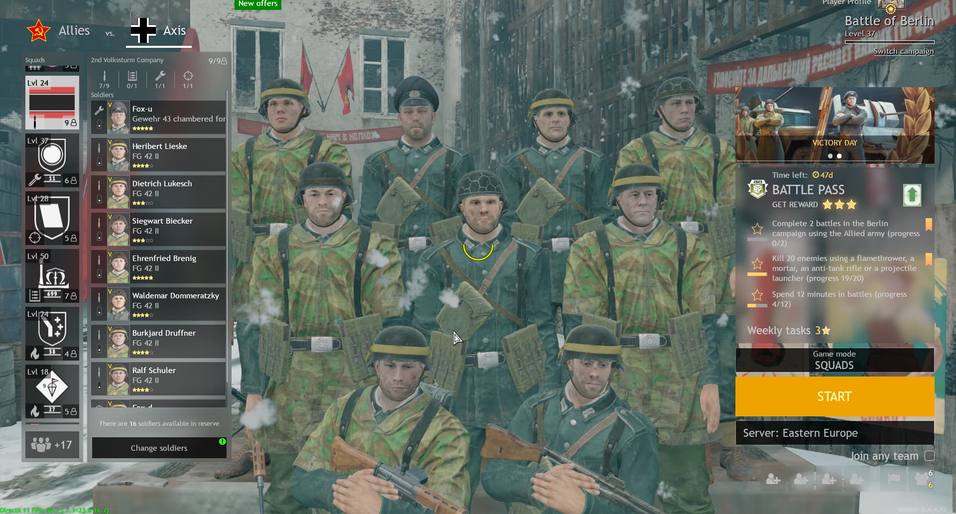
Personally I think that it looks great, BUT I really dislike how the info about current campaign is show above the soldiers, it also looks a bit too big, the second problem that I have is that in ‘‘магазин’’ or the equipment store there is a huge button to go back (it just looks bad). I’m sure that the interface will be improved before it is added but still it would be nice if there was an option in the menu to have the old interface (honestly it wouldn’t even need to change everything as it might be impossible with the new progression system, it would be cool to be able to just change the first screen with your soldiers)
get out of here no bs avatars that ain’t serious. should only be of realistic depictions of soldiers, no fantasy or artsy bs
4 Likes
agrees need more distance between soldiers so can se individual soldiers and their equipment, more zoomed out view, and able to zoom in and out, atleast few levels in and out.
of course, your opinion is very important to me, but I will decide what and when to do, as well as the developers will decide what and when to add to the game)

1 Like
we need a better view of the squad, more panned out view with more distance between soldiers so can get better look at individual soldiers and their weapons, and be able to zoom in and out. Also make a worthy background for them.
We will have different sets of customization yeS? so the current/last one you tinkered and outfitted them with should be used as background.
As in you just equipped the squad in winter gear, choose outfit so on, then in squad view you see the guys in a snowy landscape, some pine trees, burnt village house, fence etc, then go change summer outfits, go back squad screen and now in a summer background, a field with grass and trees and complimentary ruins and burning tanks in background.
Background should be dynamic and country and Summer/Winter/Fall dynamic in relation to outfits so the screen gives some immersion.
The squad screen is what greets you and the squad is what the game is all about, so when looking at them in menu should have some love. In other ways display them in the background of appropriate ‘‘campaign’’.
Then the vehicle screen really need some love, that old dump of a cramped garage you’ve been using is horrible. get the tanks out in a field and the planes on a runway, proper camera distancing and able to zoom in and out and rotate so can get proper look at our vehicles.
Overall looks like improvement in interface UI but need some more love and attention to raise the immersion and get rid of this stale boring sterile underfunded feel. And no the events and daily task and buy gold and stuff like that should be kept at minimum and be able to hide.
2 Likes
We are still waiting for an engineer in all the old prem squads.
3 Likes

First impressions:
I prefered the old colour sheme. It looked less cheap somehow.
The battle menue feels as full as the squad menue before. If the goal is to clean that up, I’d at least remove the element showing how many of which soldier are in each squad.
Maybe also the overwiew showing all the selected squads, tho maybe it is sensible to keep that one, so people are not loading into the match realising they don’t have the squads they wanted.
For the upgrades menue: I prefer the from top to bottom, but it probably makes more sense in a horizontal layout, as there’s more effective space usage in that.
The selection for the different categories seems to have to detailed symbols for the size of the symbols. It makes them hard to read. I think brining back colours would help aswell here. It makes players know which categorie they are in faster.
I don’t like the new symbols for the upgrades themselves. They seem a bit to shiny and new to me for a ww2 game.
2 Likes