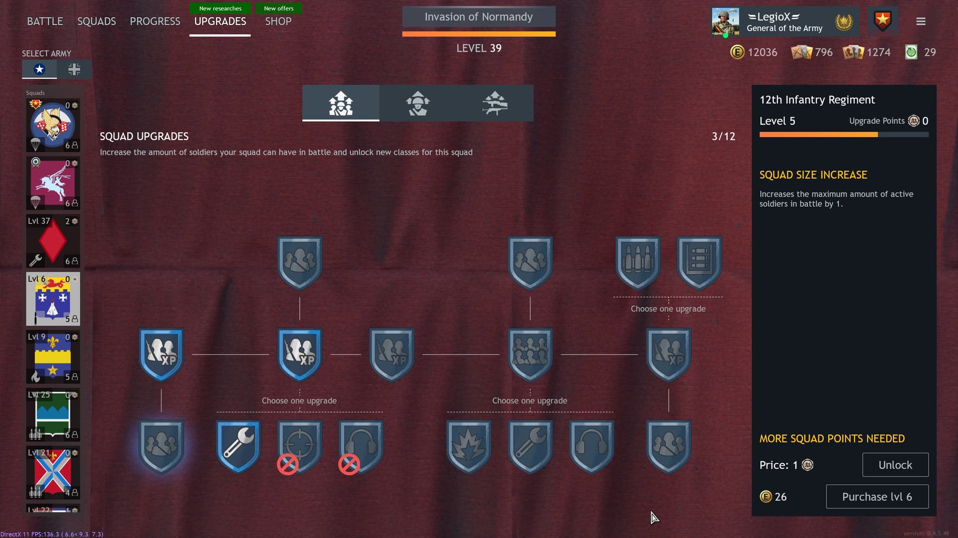
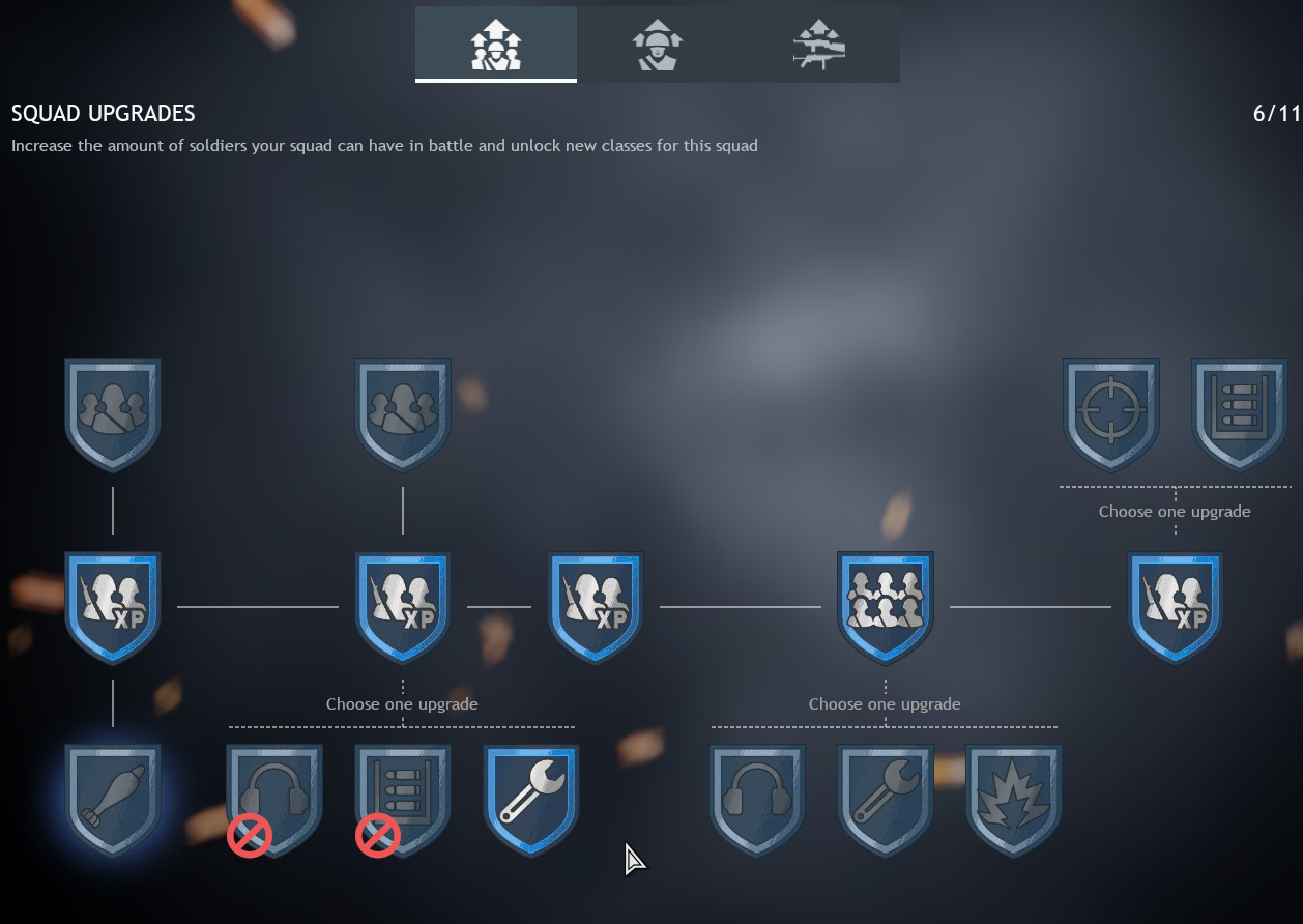
No offense devs, but whos idea was it to make it light blue/grey if you haven’t upgraded it. And bright blue if you have? Im not even colored blind and i have a hard time seeing if i upgraded something or not. You need to make them different colors!!!
finally, another thread that bitch about the shitty colouring/contrast thingy for the upgrade tree! they’re awful and needlessly make me use more brain cells than i need!
I’m not a fan of the new UI, I ‘feel’ its an itermediate measure for what is to come later, It’s not intuative at all, and if a veteran beta player like me finds it confusing. I’ll get used to it for sure, but I think its rather badly designed and what we had before was way better. Maybe stop trying to re-invent the wheel you’re just wasting your resources. It’s a minor annoyance as you’re doing a lot of stuff right, but this change, its not great to be honest.