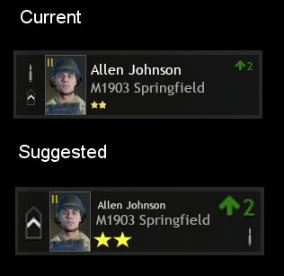
I think the way the display card is set up at present makes it difficult to see things like type of soldier (Type 1 or 2) and the training/perk level. Instead the emphasis is placed on the name.
I think instead the text should be shrunk down, and the stars and type should be enlarged to make them easier to see.
Thanks.