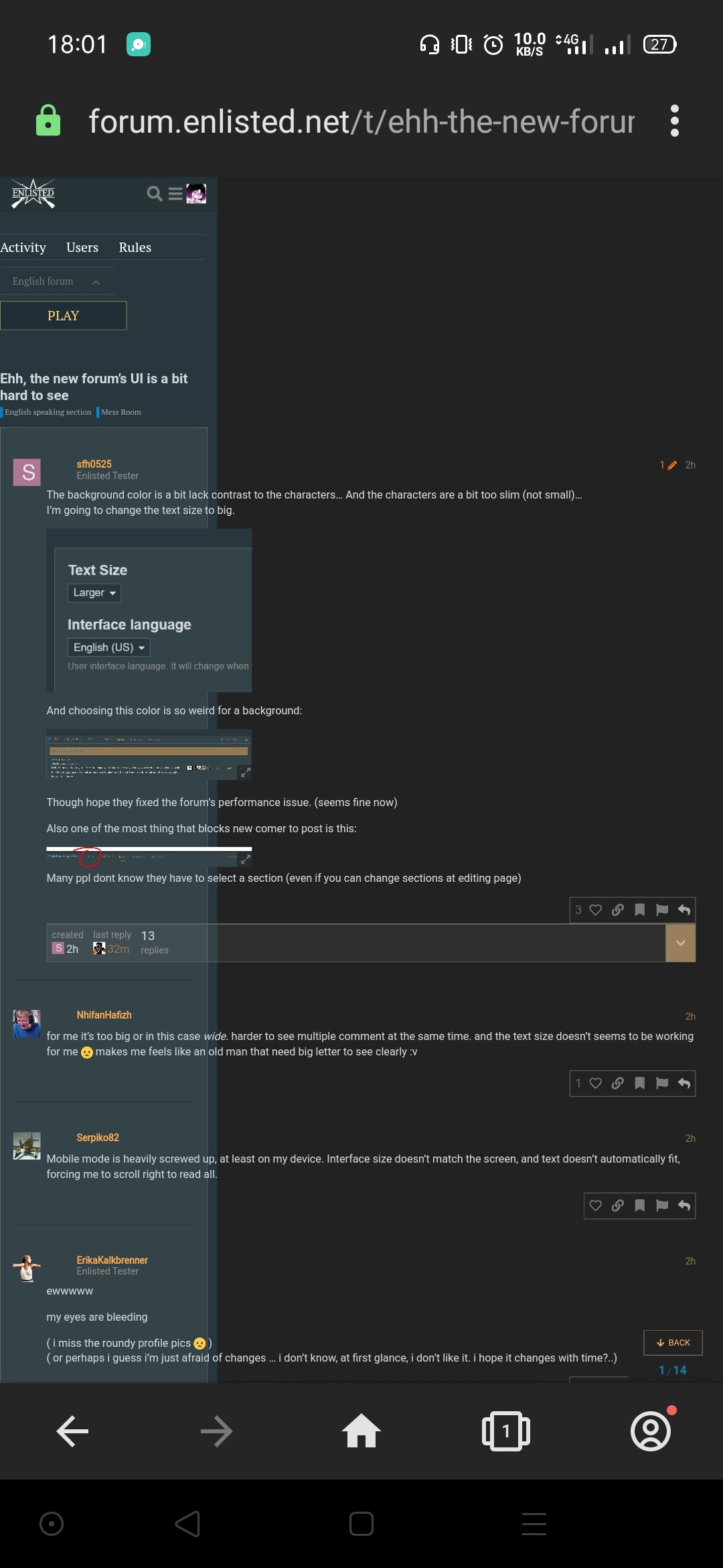
this screenshot says it all
I’ll give them some times
1 Like
Thay want to have the same visual look of the main site enlisted.net. Give them some time to tune it.
Not mobile optimised for sure
however i still hope they make the icons, text more white, or things more distinguishable
also profile pict inconsistency some square some round
I like the new UI but a few things definitely need to be cleaned up. I also wanna have backgrounds to choose from.
yes, don’t forget to use @media tags, Devs lol
Whatchu wanna do is have settings for about 4 different screen sizes:
- Mobiles
- tablets
- PCs
- HD screens
That’s it. Hope it helps, Devs lolol just kidding, i’m sure you know.
Front end - hate it hate it hate it. Humans are so annoying. That’s why I specialize in microservices, and other non-user front ends.