- Yes
- No
0
voters
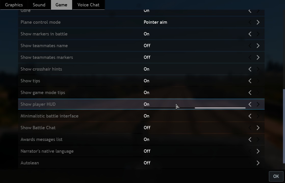
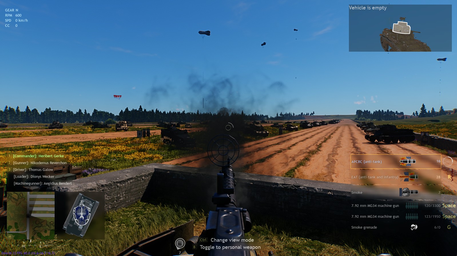
I would love to enjoy a minimalist user interface. But from what i can see the feature removed too much elements from the user interface. I don’t know exactly what should remain or stay but there are a few approaches to this. For example, i love seeing the impact screen pop up when a shell hits the tank and shows what happend. I love the tank xray as well. I would like to have the ammunition information able to be shown/hide on demand. The map can go and the crew information can stay as well but you may have to move it elsewhere to be more aligned with the tank xay moduel.