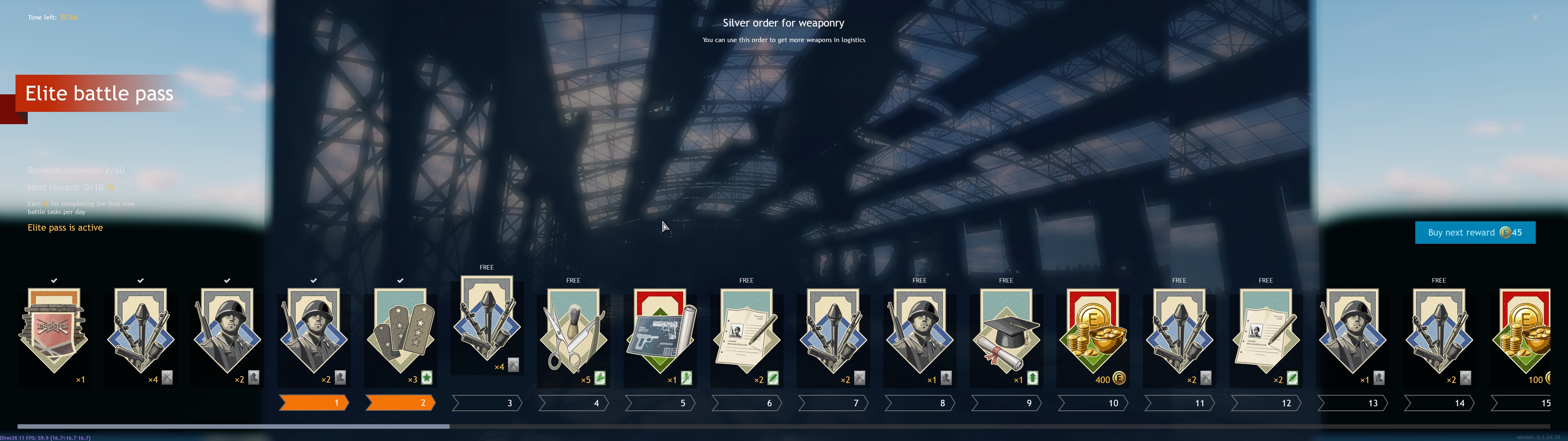
I’ve got a wide screen and it is pretty difficult to see the text on the left against a small panel of sky as screenshot below
Also IMO the cartoonish icons are indistinct/do not really convey the content of each award very well.
I’ve got a wide screen and it is pretty difficult to see the text on the left against a small panel of sky as screenshot below
Also IMO the cartoonish icons are indistinct/do not really convey the content of each award very well.
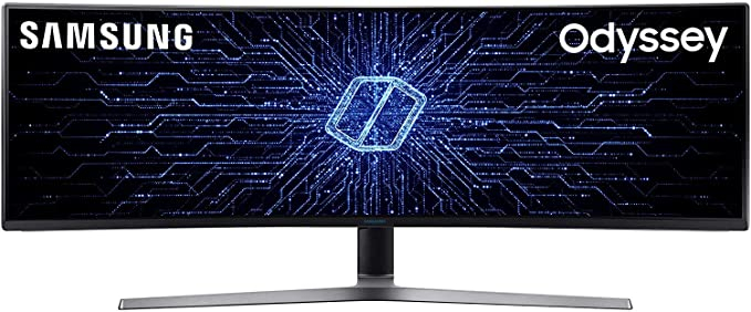
damn, what’s your resolution?
are you using one of those samsungs wider screen?
jokes aside, yeah, there should be an option to make things bigger for higer resolutions.
but for the new icons, i guess they are cool but not self explanatory as the one from before.
i have neutral feelings about.
It’s a couple of years old now so not one of hte flash new once - 5760 x 1700-ish IIRC?
I mean, they pretty much explain the context of the reward really easily.
I don’t know how you think they don’t convey the content at all?
The guns are easy enough to understand - making a visual meaning of “vhangethe callsign of your troops” is just obscure tho - and a mortsarboard and graduation diploma?? WTF - is this the GI Act or something?? A shaving kit?? Na - fails…
I mean the mortar board for me instantly created an Academy thought before I had read the details, but the call sign one I agree isn’t the easiest to understand from a picture.