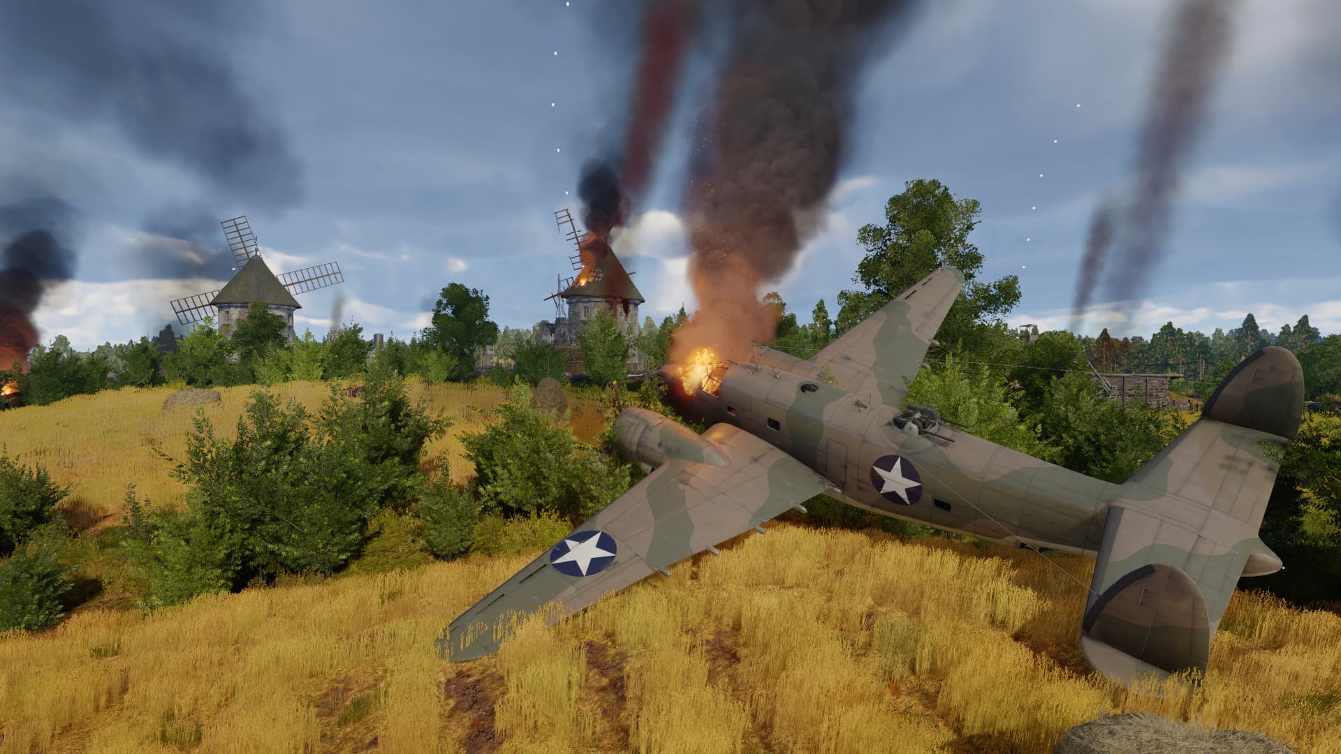
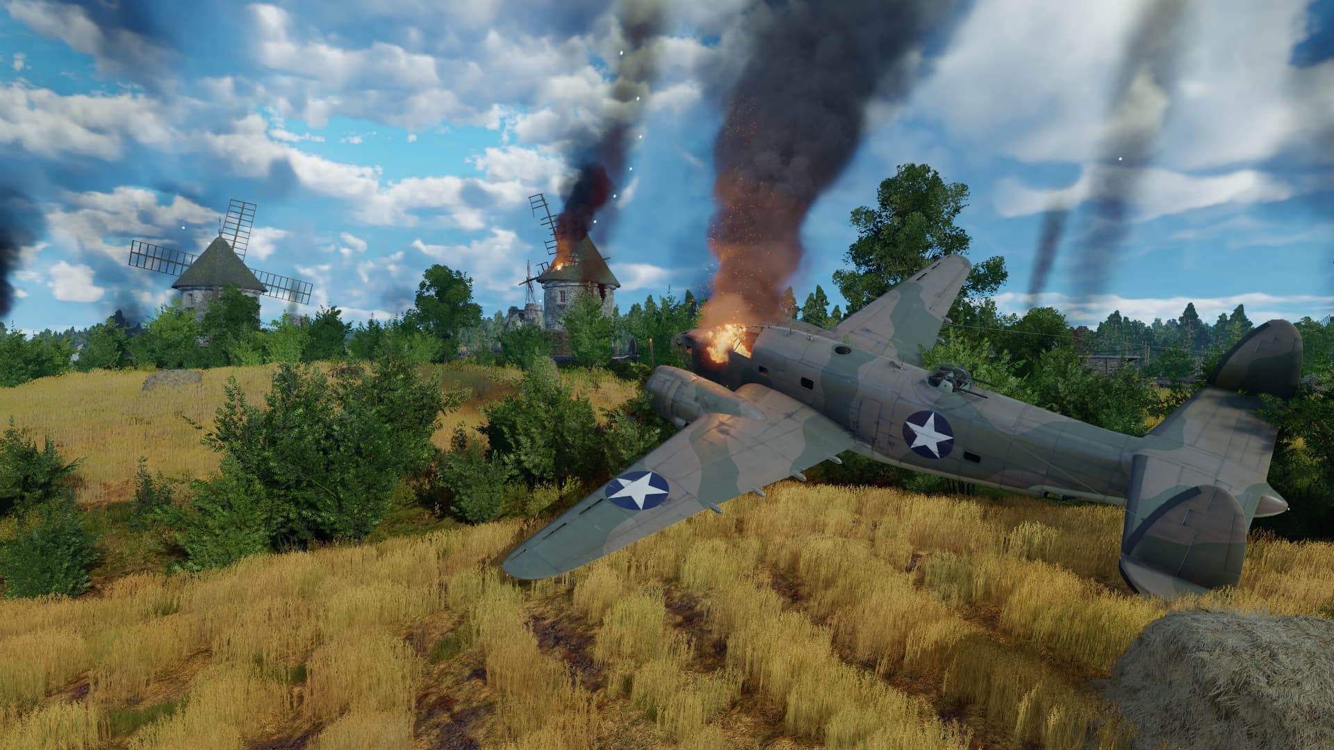
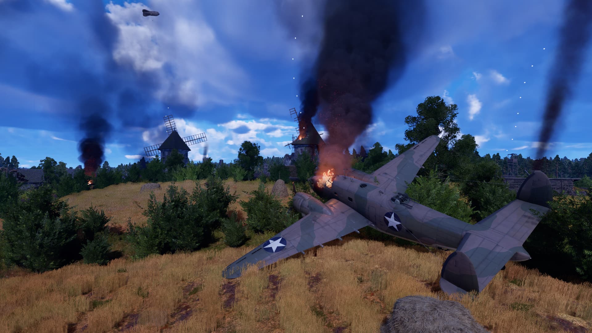
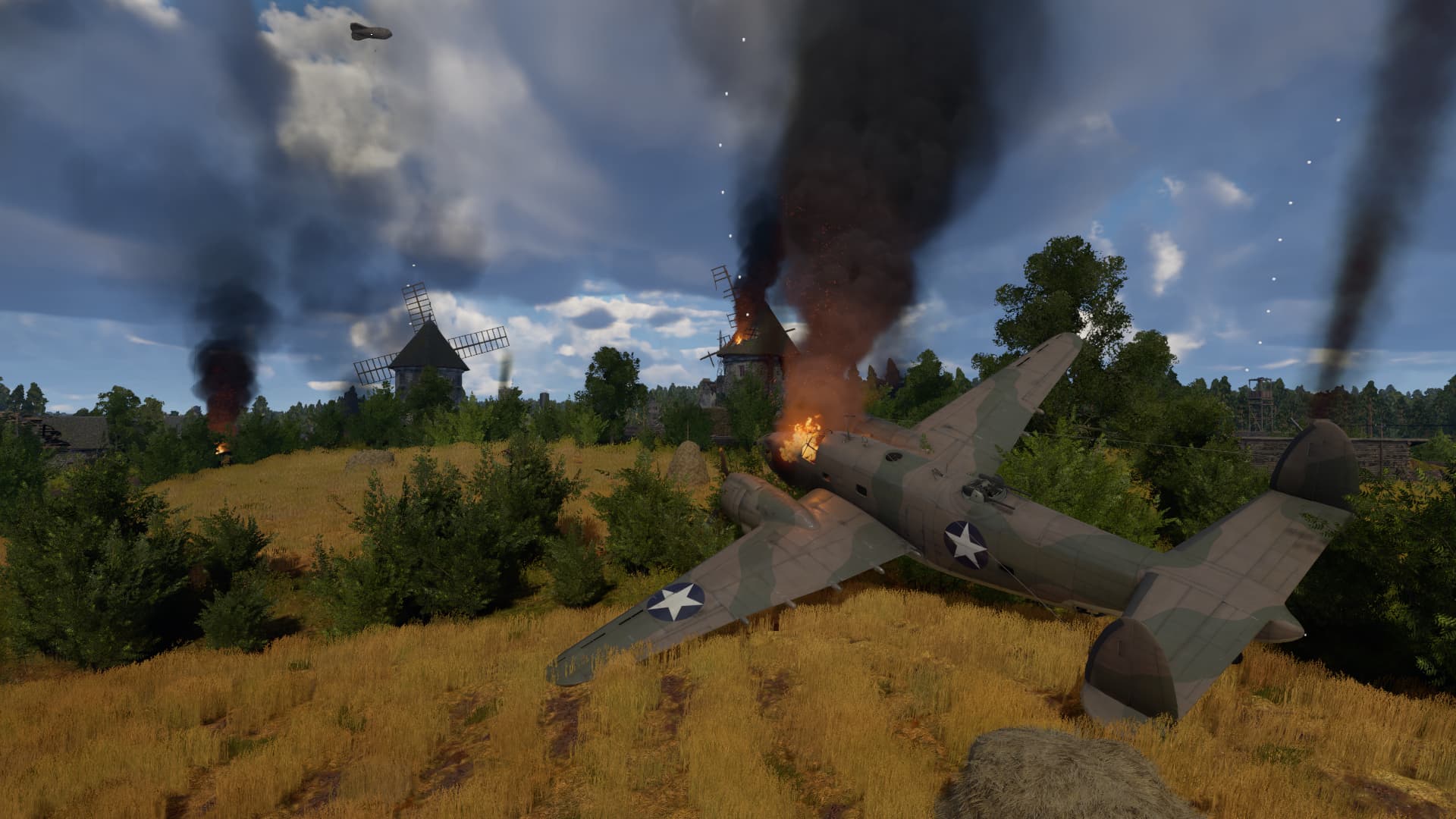
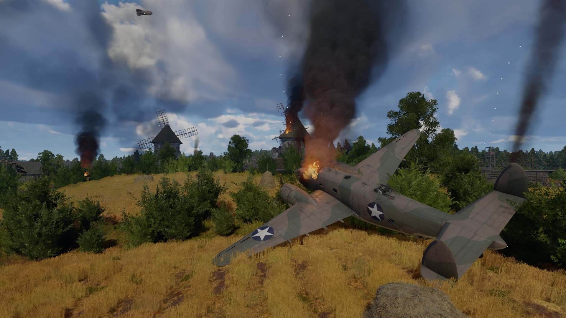
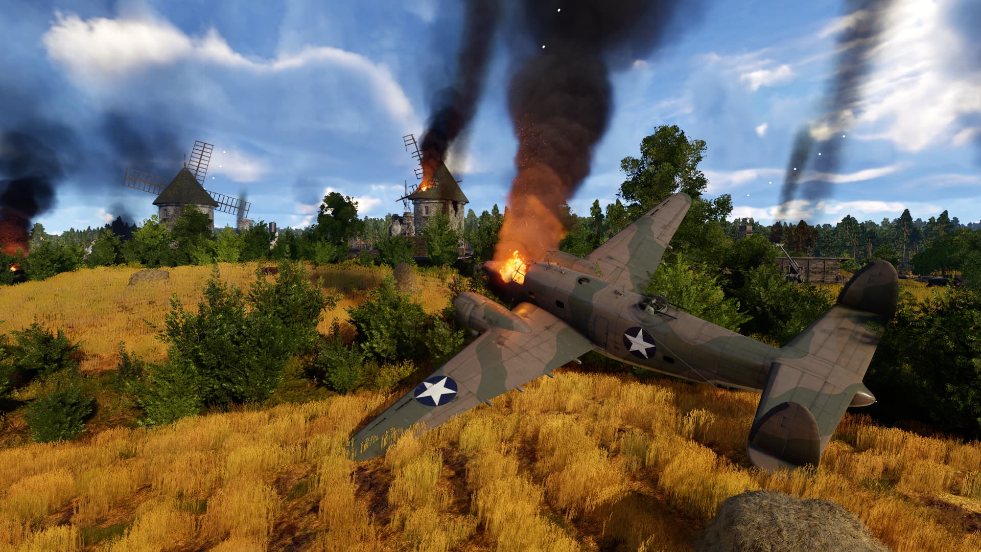
with this little experiment, i’m gonna need a bit of a help ( nothing too extraordinary or difficult ).
why? well, no reasons. though i heard many people complaining about normandy being too bright/vibrant. so i was just curious to know what people would prefer.
IF for one reason or another, none of the images are appealing, please. share your ideal palette of color. from other games or make an edit. thanks.
eventually, i’ll be making a palette pack for modders to use in their mods ( if they want of course ) and eventually make a step further and make it into a proper suggestion.
so, here are a bunch of images. i’m gonna need to know which one you personally like more than the others. :
( yeah, technically they all look the same, but there are few differences in detailz )
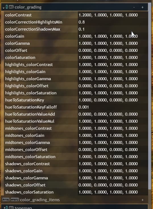
( also, it might looks basic or bad photoshop. though unfortunately, the editor does not work like photoshop. so you had no idea how trial and error i had to do just to get these reults. because it’s all about modify those numbers one by one:
so yeah… )
Sometimes war is fought on a sunny day in a beautiful place. It doesn’t all have to be desaturated Band of Brothers style “gritty realism” nonsense all the time
Personally, I think “more blueish” is the way to go. The battle of Normandy has a strong image of bluish sky.
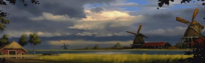
This is concept art from an old FPS, but I would love to see beautiful picturesque landscapes like this one.
just seen this post, after coming back to game, straight into pacific, i was thinking, wow, we up to, its fixed 33 and this is state of game?, this reminds me of Tunisia when it came out, then i played Tunisia, and was way better, than before.
Then i played Normandy and wow, it was so polished and nice fell in love again, so as to which i prefer in which of the above in Normandy, just have to say i was impressed at the stage it is at now.