-they overlap each other and it’s not easy to click on
…spawning on squadmates in lone survivour when they overlap that’s a pain in the ***
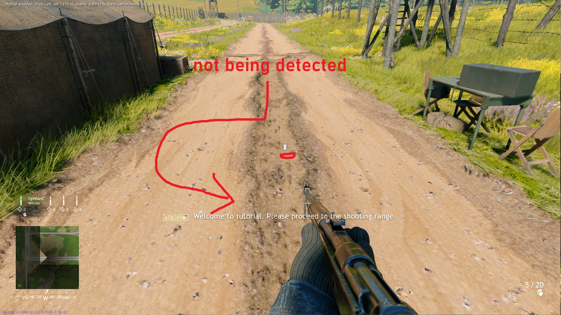
…tutorial, “run to this point”
-you can only look just in 2D
-they literally blocked important things
…my plane is ready to support team at the capture points, but these icon A/B/C things just blocked an entire map when aircraft strafing down or droping nuke
…you are
-they doesn’t tell the area of the capture point in the minimap
…all you see is an icon, not telling how far, width, area of the capture point/sectors
suggestion: easy solution , MAKE. THEM. 3D
->not blocking the view
->place them above the location
->faded away or slowly invisible while looking
->you can see the area/zone instead of just an icon
->be creative on making stuff, not old school idea
(using icon is as easy as elementary school computer class)
->turn them into 3D would be much better