Dear Commanders, Do you think the Game UI is nice(Beautiful, clear, easy to operate and comfortable?)?
i wish they would let us choose styles, like arcade, typewriter and so forth
1 Like
Yes, I think current UI is awesome. I like it a lot, they did a great job.
Feels not like FB as HnG UI. Its okayish.
Personally I dislike how the 3d model of weapons and vehicles are blocked by the UI. It kinda defeat the purpose of having a model viewer.
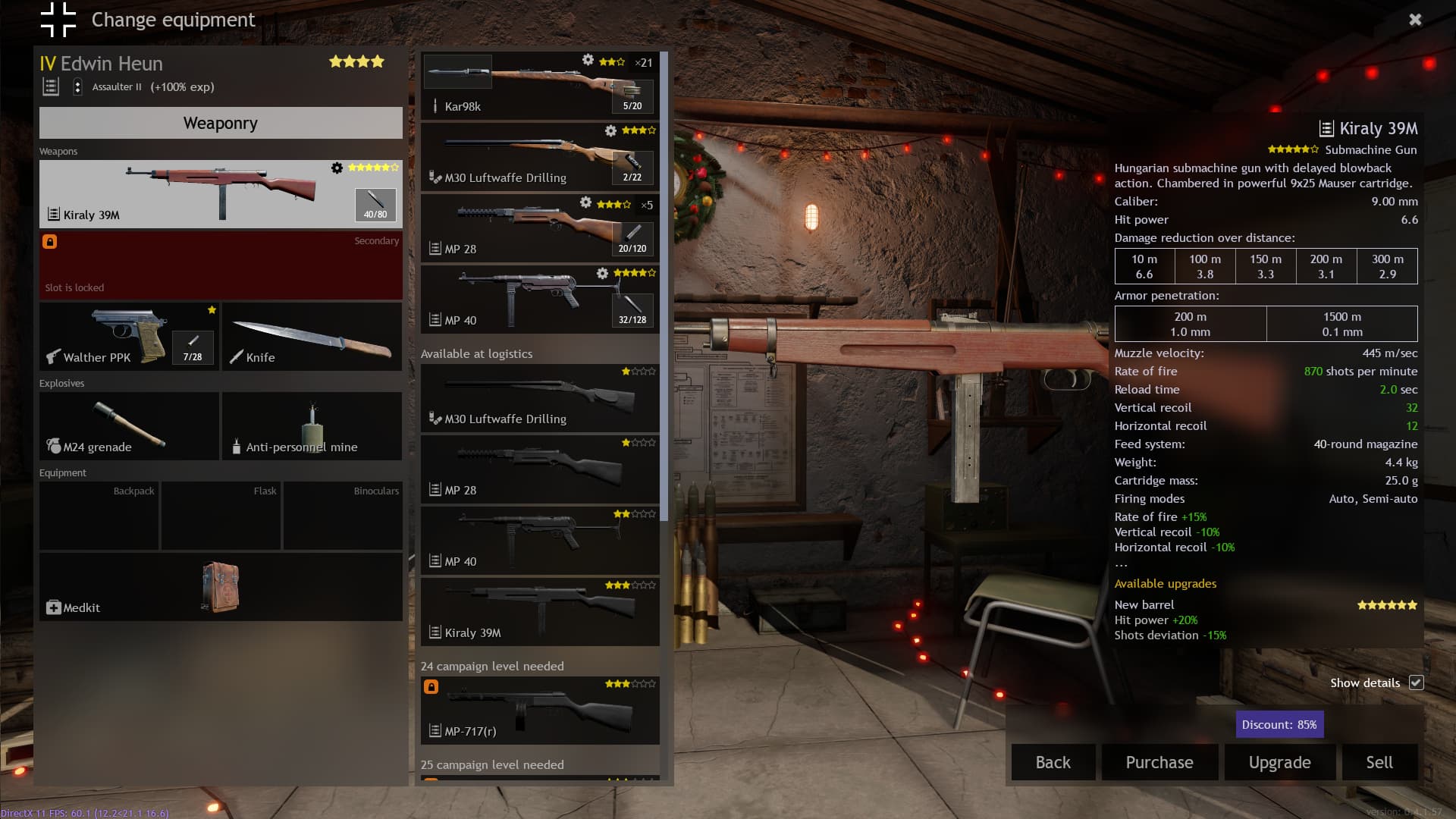
Too many things are put onto the main menu and it make the main page feel cluttered. Some of the buttons group should be able to minimize or put into separate tabs instead. I mean look at this, there are barely any space left for my man Edwin Heun.

3 Likes
You can shorten the UI of the gun information
Oh yes I overlooked the little tick mark at the bottom right of the screen. I do like how when you boot up the game you are not bombarded with discount or limited offer pop ups that is common with the f2p model.
maybe ask first if there is a botton for disable the UI in the menu
Oh look it exists, ctrl-shift-g
Relax, if I need to ask for a feature about a UI then it’s not a good UI. I’m just stating my opinion, opinion that was asked from the thread. Did that somehow offend you?
1 Like
Thinking back at when I first started, I definitely remember looking at the game and being initially taken aback by how much you could interact within the UI but I didn’t really need to look up anything in particular. I just kinda got it eventually by tinkering over time so I wouldn’t say it’s confusing per se, it can just be a lot to take in at once I guess. But now with the added experience I just stroll through with no problem.
In-game the UI is pretty solid, especially with the work they’ve done on showing the status and equipment of your other soldiers. The objectives are important but don’t blind you. Ammo and equipment I have set to disappear when not in use so there isn’t really much clutter I notice while fighting
Even after getting used to it tho, I still prefer the old way of changing formations and attack behavior. It was much more quick and fluid with less to do. Also I feel like there isn’t an easy way to see where exactly you are looking to place soldier orders. It isn’t always at the center of the screen (unless you aim in but even then its not 100%) and it is dependent on the Y-axis (so up or down) in which you are looking. That isn’t intuitive or accurate and should be changed.
3 Likes
No. It used to be on console until they started messing with it to fit in unnecessary items such as flask. Then the latest update made firing artillery unnecessarily more difficult to do
1 Like
I’d love the ability to toggle the visibility or opacity of individual ui elements to customize what’s on screen. It’s a beautiful game at times, and it would be nice to see more of it
1 Like