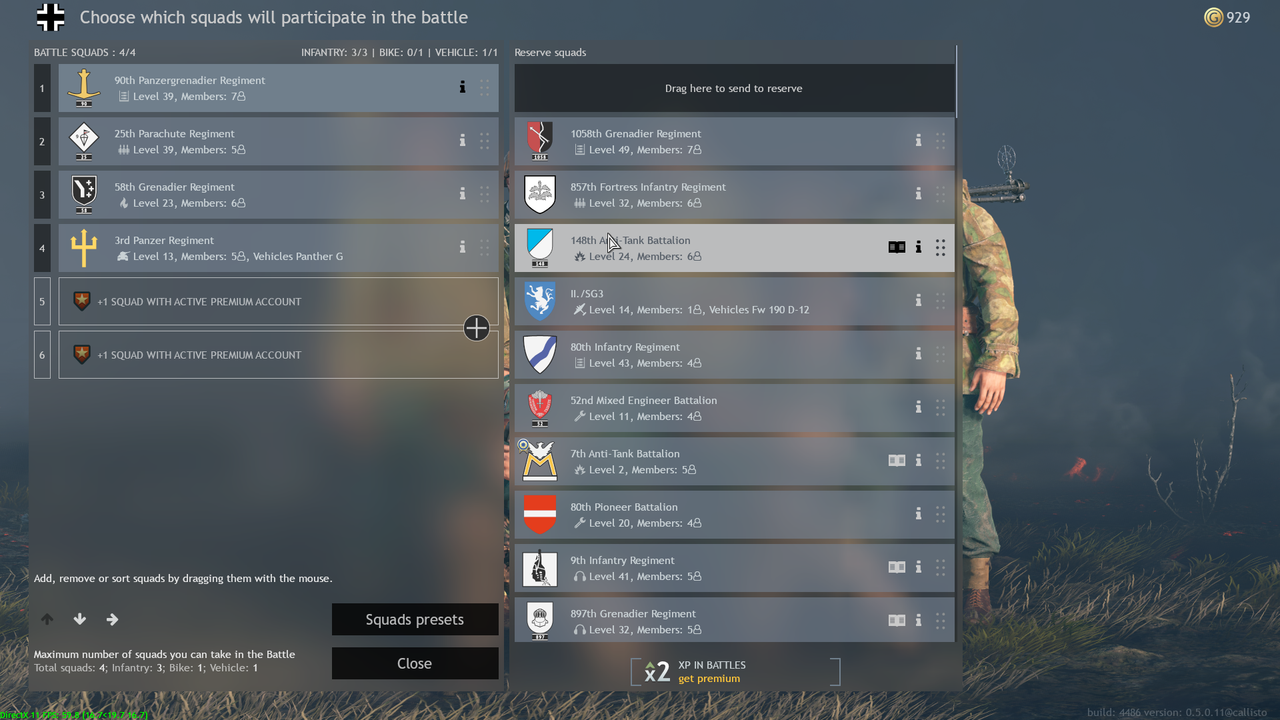
Ok, i’ve held this for a while but now, having to manage 90+ squads, the situation has really degenerated ![]()
Current situation: 
Alright, issue is, the rework of the game interface is actually nice to me, I like the tech tree, having ALL items and soldiers in the shop in a single page, the new perks tree…all is wonderful IMHO.
But, yet we forget to mod a screen which now is legacy and obsolete, also considering the new GIGANORMOUS amount of squads to be managed.
As there is no filter to use, just a raw dump of all your faction squads in one single massive column like it was Niagara Falls, it’s quite hard to figure out where the hell you are…
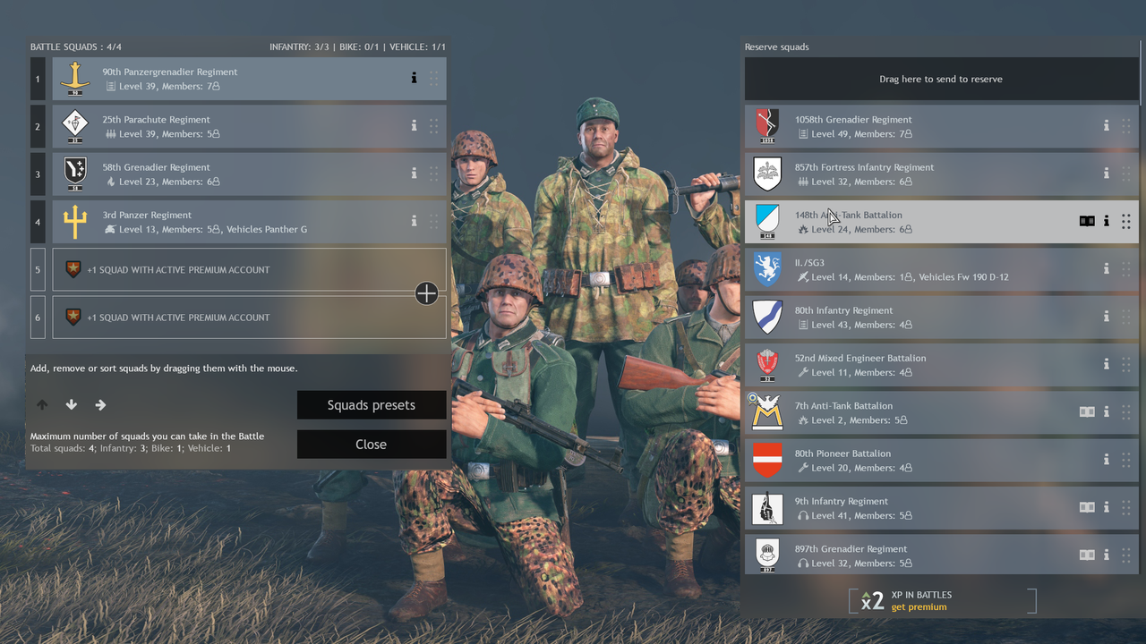
First issue, there is no visibility of the squad under the menu…not even an hint…just the tip of a rifle and the usual brown or whatever color uniform which is not an absolute ID for the squad u look for.
Maybe you can remember the name of your dudes or their face, or any sort of customization could help you find your fav squad…this, in case you can ACTUALLY SEE THEM…as it is not currently possible.
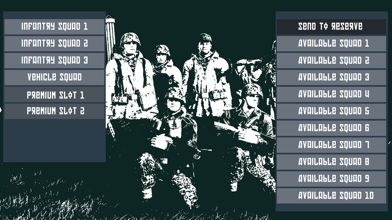
So, since we facelift the game, why we still have this old, poorly functional, hastly designed interface?
If you dev guys are too busy fixing or reworking mechanics, I totally get it…but can you give at the very least a resize?
Thank you for your time reading!

