well ugh…
so this is the new help UI.
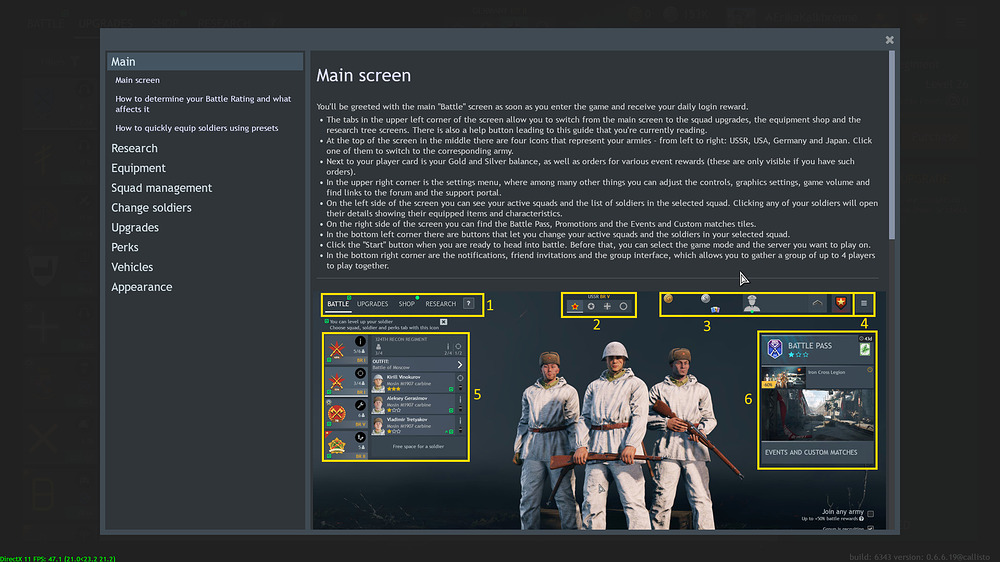
it’s good. has pictures innit, and coincide text for all fields.
however, i would recommend a very simple visual change.
and that is, change the list symbol order to actual numbers rather than dots.
aka, from this:
° the tabs in the upper left corner […]
° at the top of the screen […]
° Next to your player card […]
° […]
to this:
-
the tabs in the upper left corner […]
-
at the top of the screen […]
-
Next to your player card […]
-
[…]
why?
well, i think it would match the visual reference with the images.
and to be honest, if enlisted people are like most forum users, reading is rather overrated.
hence, one just see the numbers and will be easy for them to see what it’s all about.
rather than count the dots.
if you catch my drift.
but maybe i’m wrong.
