The HUD should be as minimalistic as possible while providing enough information to the player. The current vehicle UI elements are too big, and some UI are placed at terrible location requiring the text description to be stated explicitly.
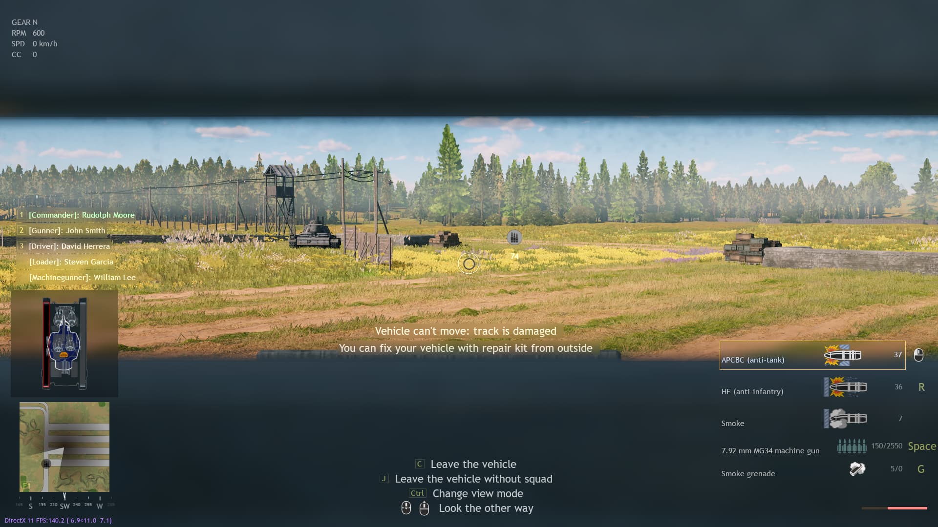
Some of the text tips are redundant and are more annoying than helpful as it stay on the screen persistently. For example the “Vehicle can’t move: track is damage” and “You can fix your vehicle with repair kit from outside” tips are redundant as there is a HUD element showing a 2D x-ray view for the vehicle components status in real time.
Vehicle UI
Current tank UI

New tank UI with one Loader down and 1 MG loading

The picture above is just an example UI using the same color palette as the current one. I am by no mean saying this is the definitive way of building a clean and informative UI, I’m just showing what I think could be improved.
Suggestion:
-
Reduce the HUD font size
-
The shell selector is not required to show the pictures for all of the available shell types. Only the current selected shell type need to be shown, the shell type picture should be changed when a different shell is selected.
-
The shell reload status could be represented by the horizontal border of the current selected shell UI element. The length of the border correspond to the status of the reload progress.
-
Vehicle tips should be closer to the 2D x-ray view so that the text tip would still make sense without having to be explicit, this make the screen feel less cluttered as the text description is shorter.
-
Remove the "Vehicle can’t move: … " tip
-
The “You can fix your vehicle …” tip should fade away after a few seconds. It should only reappear when the player press the “Fix button” from the inside of the tank, in other words they try to fix outside components from within the tank.
-
Move the vehicle crew selector down and to the right of the minimap, the current position above the 2D x-ray view block the player peripheral vison when using the commander hatch.
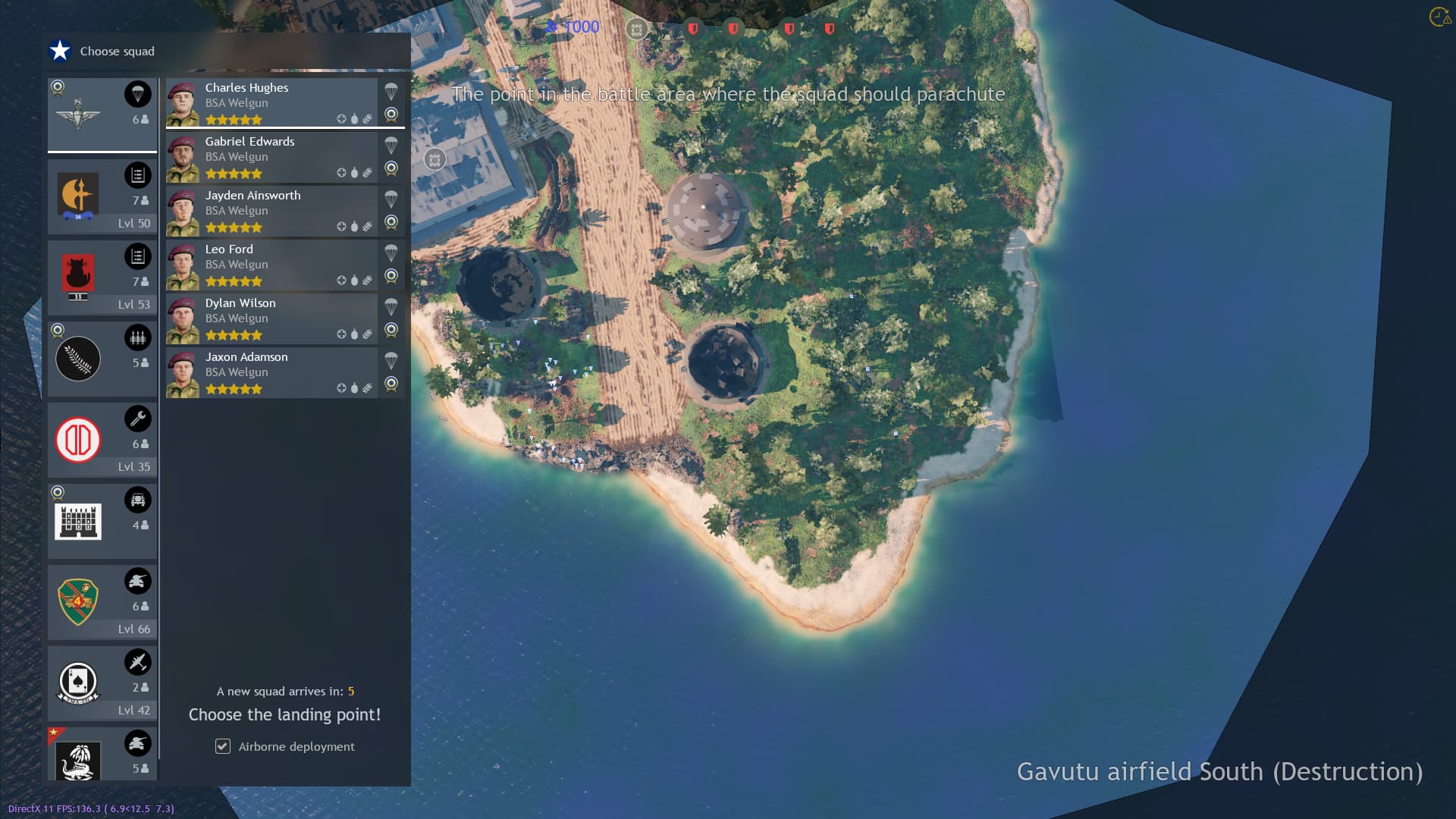
The squad selector UI is terrible as it block part of the screen making the player miss events happening near the left side of the map. Sometime an entire objective is blocked as shown in my previous post.
The squad selector block other HUD element like the chat window, mobile spawn point UI from rally point or APC could be blocked disabling the players’ ability to select the spawn icon.
The area to the left side of the screen also block a portion of the paratrooper jump area as it is behind the squad selector UI.

Suggestion:
- Add a button with a customizable keybind to minimize/maximize the squad selector UI.