The background color is a bit lack contrast to the characters… And the characters are a bit too slim (not small)…
I’m going to change the text size to big.
And choosing this color is so weird for a background:
for me it’s too big or in this case wide. harder to see multiple comment at the same time. and the text size doesn’t seems to be working for me makes me feels like an old man that need big letter to see clearly :v
Mobile mode is heavily screwed up, at least on my device. Interface size doesn’t match the screen, and text doesn’t automatically fit, forcing me to scroll right to read all.
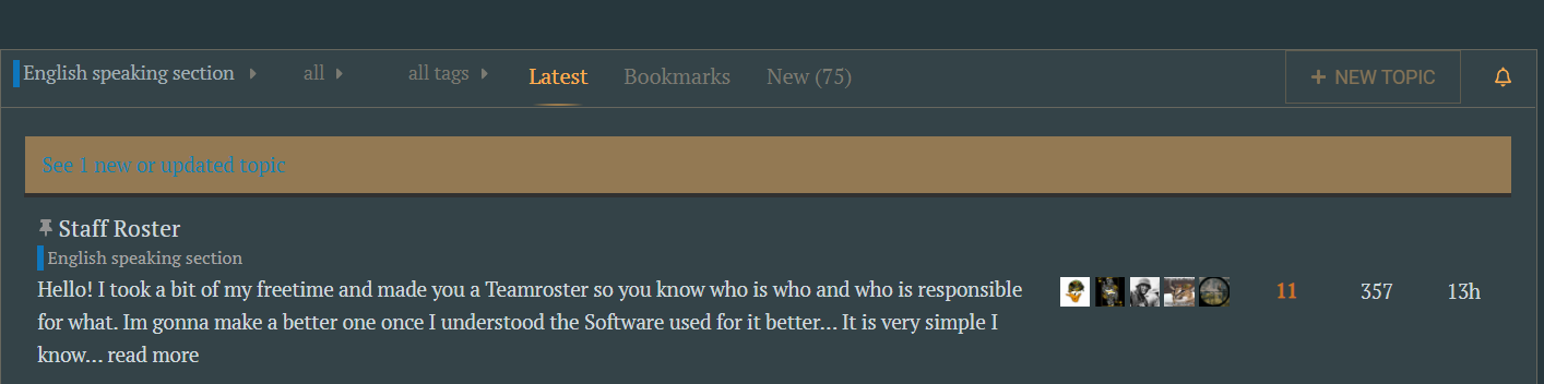
( i miss the roundy profile pics )
( or perhaps i guess i’m just afraid of changes … i don’t know, at first glance, i don’t like it. i hope it changes with time?..)
It will require some time for me to get used to it.
The “rough” forum we had wasn´t really anything fancy, but at least for me it was easier to navigate through in comparison to new one.
Some letters/boxes should be a little bit bigger, but other than that it is a matter of time until we get used to it.
also yeah… It is a shame we don´t have them anymore
Oh lord, it is ugly, hope they give the style.css file some love.
The font used for some things has changed for like Calibri or something. A bit harder to read than the more rounded version:
Under the post name, different and tiny font for the forum sections
In general, font on replies to a post (username, comment content, reply button) are too big, buttons for a comment (like, link, save, flag, reply) are too big as well, while font under the forum post (the one for the links to the forum sections where the post was published) is too small.
I have to read the forum on 80% zoom.
Also too big of a font and buttons are the ones used on the user-popup, where username doesnt fit in the area preassigned (why have itm there?), and you can see few notifications due to the big text size, plus links are less noticeable due to the colour change to grey:
Plus, it seems on mobile that blocks were used for replies without considering the left margin into the blocks width or something like that. It worked back in the day, so maybe they messed the box-sizing CSS variable?


 makes me feels like an old man that need big letter to see clearly :v


