Now
Before
Some times ago
And BP progression is hide in the secondary menu
Yes
It seems more an improvement, for the moment there is no need of two squad menu
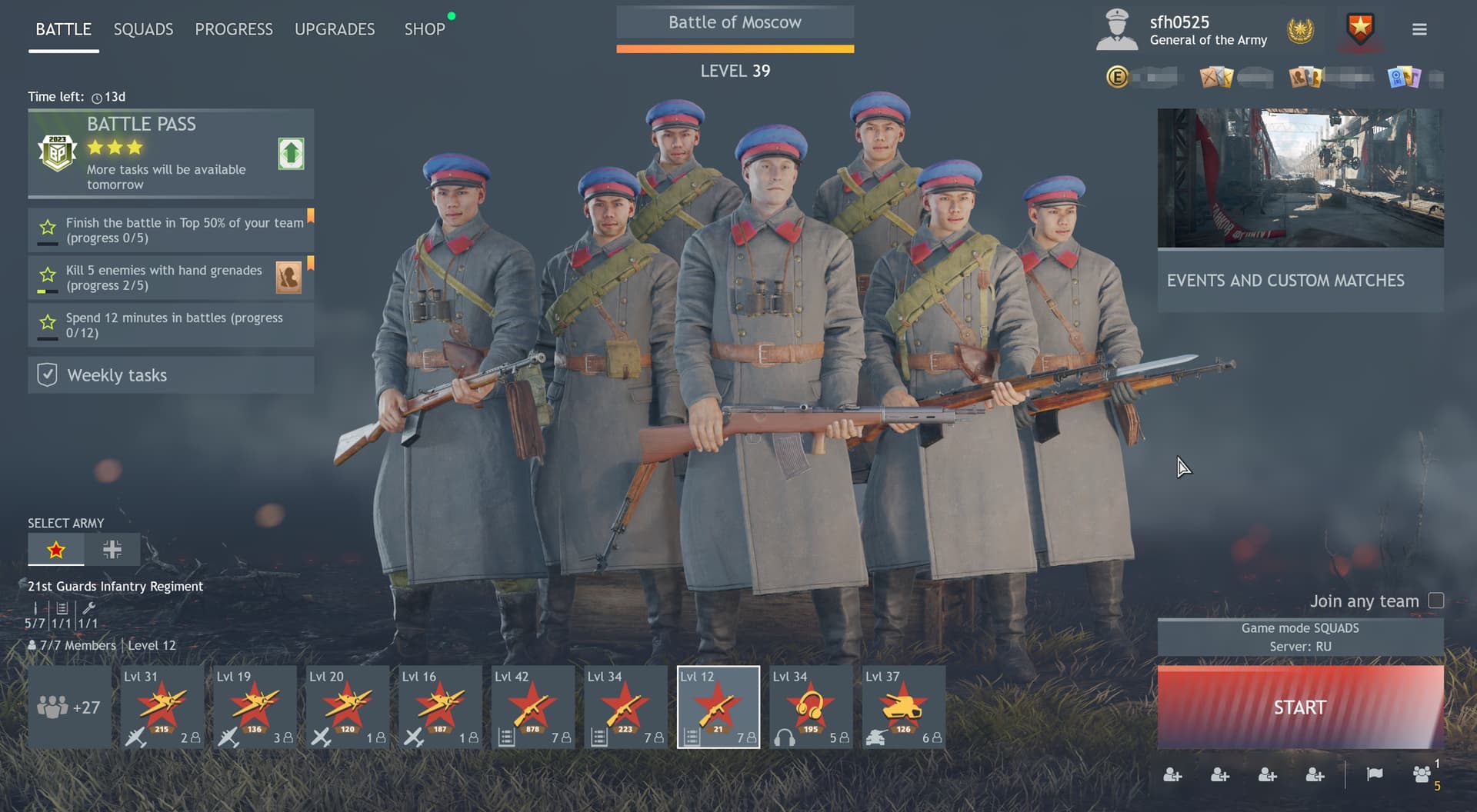
Almost, but now you have an extra click to see the daily tasks which are hidden /facepalm, as we also got the extra click to change the servers, with the original new UI update.
I think they are mindf*****g us. Or they are incompetent. Sadly, I fear it is both.
Just revert to the original UI FFS! and we will gladly forget it ever happened, don’t worry you won’t get fired, efficiency isn’t a metric in FailFlow.
yea the new UI looks nice but the old UI was more minimal is easy
But they are shown during queue, and can be viewed in game at any point. I don’t think it is necessary to be shown at all times. Same with changing servers, is it really a function that gets changed that often by a majority of people to take up main menu space?
But they are shown during queue, and can be viewed in game at any point. I don’t think it is necessary to be shown at all times.
For over 2 years it was shown on the main screen, during which time NOBODY complained about it being shown, furthermore couple of other games I played all had battle pass tasks shown on the main page.
Do you even play this game?? How many games have you played?? How many battle pass task have you completed?? How many battle pass task have you rerolled?
But YOU don’t think it needs to be shown, right??
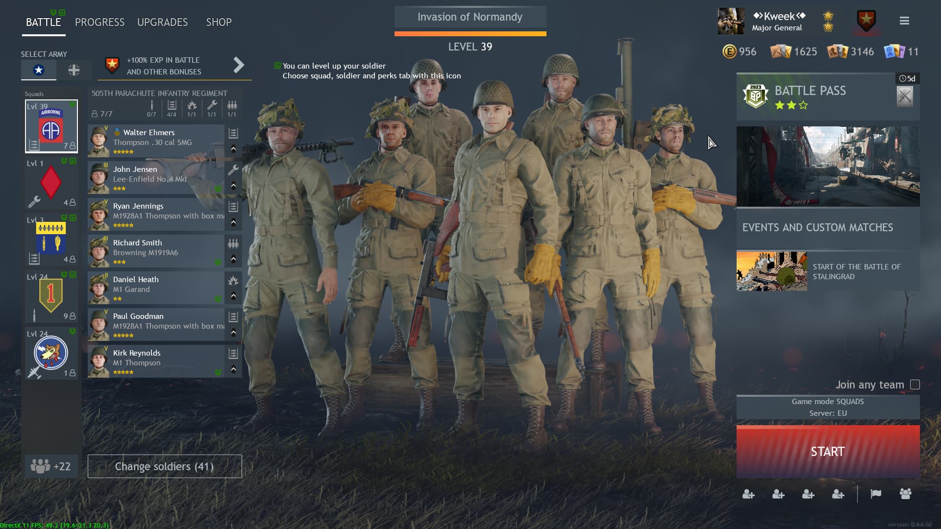
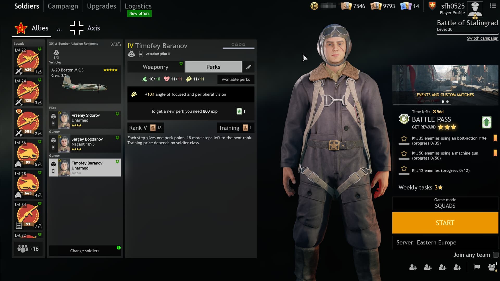
Let’s take a look at the screenshot, Events and custom matches tab takes up roughly the same space as the battle pass task did, but we also have the stalingrad event tab, right??
Isn’t a stalingrad event an EVENT? So why isn’t it under Events and custom matches tab? So basically you took up the space for battle tasks PURELY for custom matches tab?? Why? Why are custom matches so much more important than battle pass tasks??
Oh, right, YOU don’t think it needs to be shown!
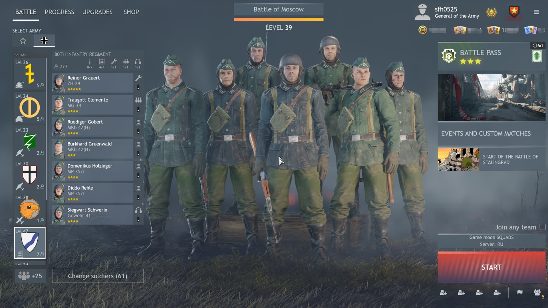
Same with changing servers, is it really a function that gets changed that often by a majority of people to take up main menu space?
Let’s take a look at the screenshot, the region tab is shown as before, although a little bit smaller, so it’s actually taking LESS main menu space, and you also made the start tab BIGGER, but instead of drop down menu, we have the aforementioned extra click, not only that, a whole extra screen to change the region?? Why??
And let me reiterate, do you even play this game?? How many times have you changed servers? You know, we also have NA servers which are a significantly different time zone than other two servers so when playing odd hours people switch to more populated time zone for example??
In conclusion:
There was and there is enough space for battle pass tasks to be shown but they are not because…?
This is your whole problem, you mess around with stuff nobody asked for, and don’t address stuff people repeatedly ask for.
Well considering I can only provide my opinion from my own perspective, how else would you want me to express my views on it?
I do actually, and I have over 2100 games played with a 75% winrate while playing mostly solo. And have done every battle pass since I started playing. You can look over my stats if you really care:
As for rerolling, I use them mostly on campaign-specific task, all others I complete. You only get a handful of rerolls though, so again, it isn’t something done often enough that I feel inconvenienced to go to another window briefly to use it.
And with it showing on queue, I can review it before every game. And even if I miss it somehow I can check my progress in-game.
Stalingrad is an event, but it is one they are promoting given the historical significance, but there is still the “Mod of the Week” event under custom games as well. which when custom games gets the upgrade that they have spoken about before, then it makes sense why they would highlight it to players more.
But at the end of the day, the Battlepass button is just as large as the others not including the banner that drops when you hover over it, which is fine since it isn’t needed for the battle pass. But I don’t see how it is considered less important especially when it lies on top of all the other options in the heirachy.
Well yes it was as I said, it looks like it was combined into one button so that the server change option is with the other game mode options, saving space. Altogether this isn’t changed that often unless I go to practice mode for something.
Also, I don’t often change it to European servers because I don’t like the ping spikes, but I have in the past and maybe had to change them every couple of hours. So I again dont see a problem going to another window briefly to change a setting that will stay the same for a couple of hours, if not days.
It isnt about being asked to be changed though, there are other aspects that need to be considered such as:
People have been asking for a way to chat with other squadmates in the main menu, and so space needs to be made for that.
Customizations are going to be expanded and so players need to have their soldiers unobstructed to see the cool things they have equipped.
There are then all the major changes coming with the new Merge update.
Things have been changed based on the feedback of the players (which is why the upgrades tab got improved as much as it did after it was changed, and why the soldiers’ inventories were returned back to the main menu) but sometimes compromises need to be made. I am always open to hearing an argument for changes but personally, I just haven’t seen anything that really holds water.
Recent changes were an improvement when you take other factors into account imho.