The part of the new interface I take the most issue with is the new upgrade screen.
Problems:
-
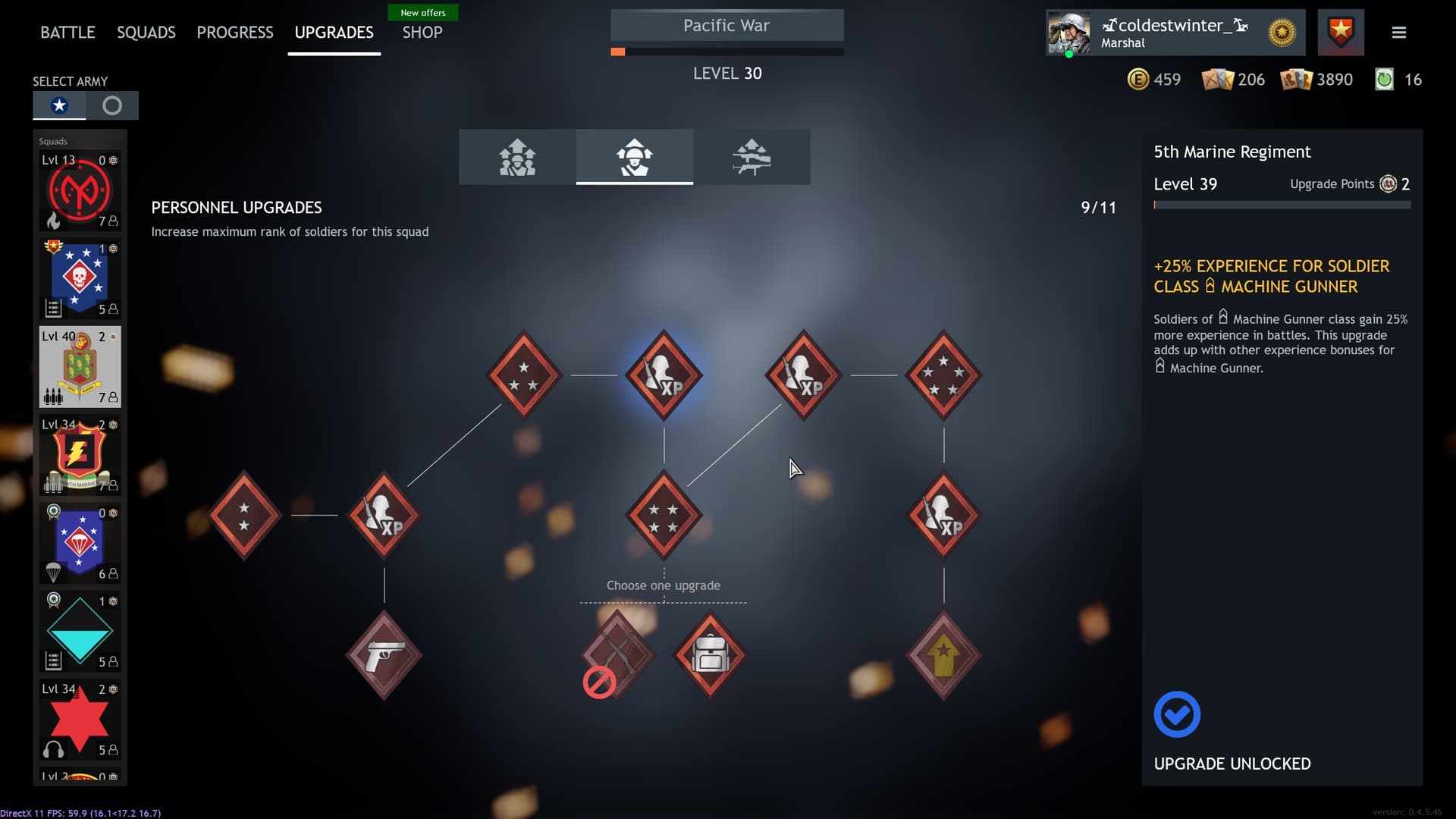
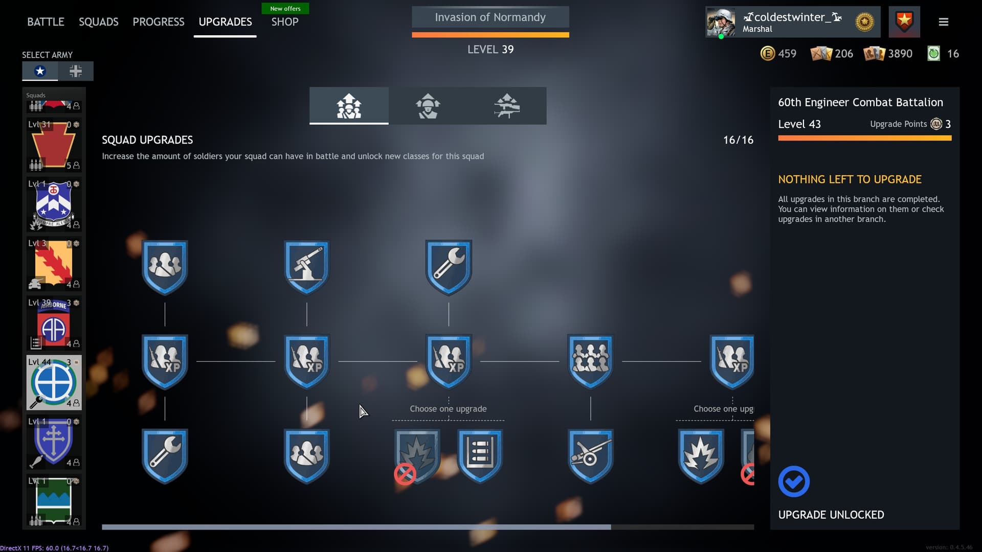
Background particle effects are distracting and constantly fill the screen.
-
I personally don’t like the big red symbols on squad upgrades that weren’t chosen.
-
There is not enough visual distinction between upgrades that have and haven’t been taken. For example, there is only slight difference in the red colors of personnel upgrades that have and haven’t been unlocked.
-
Information overload. For a new user I think this new upgrade screen would be extremely confusing. Relevant information like the number of upgrade points is hidden away in the top right corner while the player has to try and figure out what they are looking at. I think the top-down tree format was a lot more understandable, that way there is a clear visual indicator where the tree starts.
-
Different upgrades tree may be unclear for new players. The new interface has three somewhat small and unlabeled buttons above the trees that allow players to switch between squad, personnel, and weapon upgrades. These buttons need to be more clearly labeled so that new players understand what they do. The text off of the left side of the screen technically labels each of the upgrade trees, but relies on player to understand which button leads to which upgrade tree.