Enlisted
UI suggestion
Archive
Suggestions - Archive
Kokishi
March 24, 2021, 7:11am
1
5b7045f9525b975077679534103bdf8faa7ba5c1853f3590a285bd392fd2a797
1920×1080 472 KB
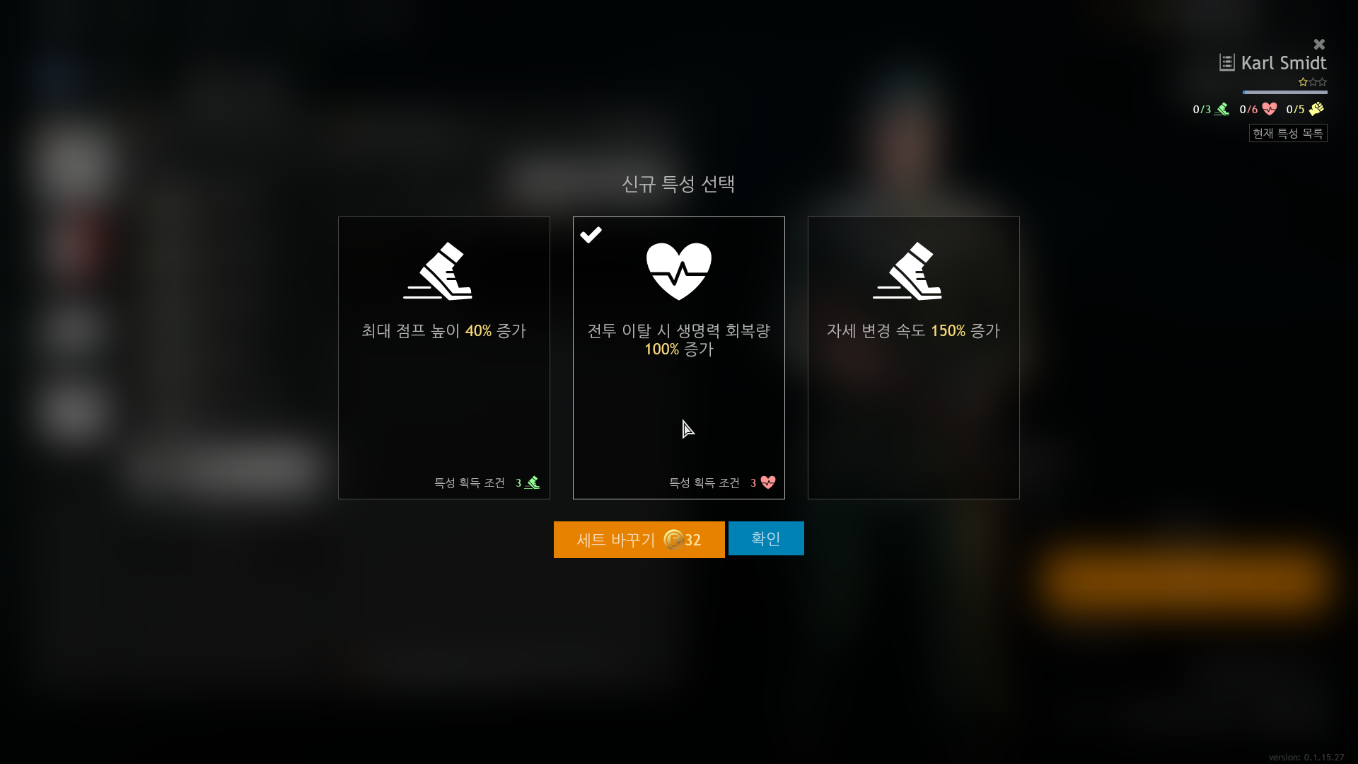
It looks like to intend inducing cash payments and there’s a possibility of making a mistake. I suggest that reduce the size of the gold payment button than the general selection button.
3 Likes